Windows 11 just got a fresh preview build which brings a slew of changes with it, including a new volume mixer, plus some tweaks for better accessibility in the OS.
Preview build 25309 has just been made available via the Dev channel, and it has given the volume mixer an all-new look.
As you may have noticed, there are bits of legacy UI elements in the Windows 11 interface that are outdated and rather jarring when they suddenly appear on-screen. The volume mixer, accessed from the taskbar (system tray on the right), is one of them, but in the new preview build, it now has a nicely modernized appearance.
The mixer allows for adjusting the overall volume, and the volume on a per-app basis, plus there’s a fresh addition here in the form of quick access to spatial audio settings. This lets you turn the feature on and off, or select different types of spatial audio such as Dolby Atmos for example.
Microsoft has also made improvements with the Voice Access feature in build 25309, revamping the help page which shows you all the voice commands that can be used in Windows 11. This now has a cleaner layout and is easier to take in, with a search bar so users can locate the commands they might need when operating Windows via voice.
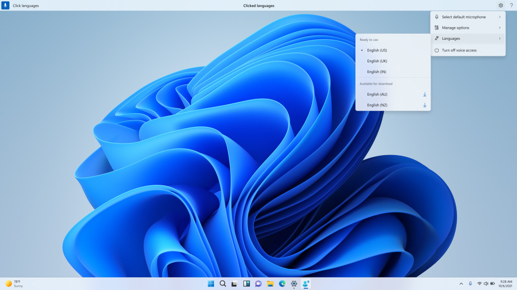
On top of that, Voice Access is now available in some new English dialects, so as well as US, we now have UK English, along with Australian, Canadian, Indian and New Zealand English.
Oh, and there are also some new voice commands, one of which allows you to select a specific slab of text (from word ‘a’ to word ‘b’).

A whole lot of tweaking is in evidence elsewhere with the Windows 11 interface, too. We’re talking about updated touch keyboard settings (new options for when to show it), and minor tweaks for the taskbar (so the search box is lighter when Windows is set to a custom color mode, such as dark mode).
Widgets are getting theme-aware icons, meaning that their icons will have their contrast ratios adjusted based on dark or light themes to allow them to stand out better and make their relevant details clearer.
There are also changes for snap layouts with build 25309. Microsoft is still experimenting with shorter periods of time for the snap flyout to appear, in order to improve discoverability for this feature.
For the full list of changes and known issues – there’s a lot of other work on the interface present here – as well as bug fixes, check out Microsoft’s blog post.
Analysis: A whole lot of strides forward for the UI
It’s good to see Microsoft keeping up its push for better accessibility, which has been something of a theme in recent times. There’s plenty of laudable work on voice commands in this new preview build, with some useful additional commands to make working with speech to text easier, and that improved help menu, which looks much better now. The changes to deliver better contrast ratios on widget icons will help people with low-vision, too. Good stuff.
There’s some interface work going on in the background too, because as leaker PhantomOfEarth pointed out on Twitter, the (hidden) photo gallery feature in File Explorer (read more about that here) has received a touch of polish in this build. Clearly, there’s a lot going on with the interface right now.
As ever, we can expect bugs with early versions of software (and the Dev channel is the earliest). Indeed, Microsoft specifically notes that the Voice Access help may go awry in places at this stage, and that descriptions and supplementary info for some commands might be inaccurate, so watch out for that.


